Monday, March 29, 2010

ARP 2600 Reference Sheet, 1971


ARP 2600 reference sheet from approximately 1971.

How far synthesizer manufacturers have come when it comes to reference sheets.

And to prove this point, I've scanned this ARP 2600 reference sheet from approximately 1971 so you can compare it to the 1980 Moog sheets I've recently blogged about (Minimoog, Polymoog). Down right primitive.

But it does have a lot to say.

Lets start with the paper choice - a medium-light blue. Maybe they picked this colour because early 2600s were known as 'Blue Marvins', but even ARP must have realized this makes it harder to read and converted over most of their later reference material to the almost-universal standard of black text on a white background for good readability.

And speaking of the text, you can tell ARP was having difficulty trying to decide whether this was a 'specification sheet' as they refer to it, or a marketing piece. To me, most of the tiny crowded text on the page is a sell-job to live performers and educators, sugar-coated as reference information.

I'm not saying marketing material was non-existent in reference sheets, but usually the more flowery text was saved for 2- or 4-pagers like this two-page SRM CAT sheet. Lets face it, ARP just didn't have the room for all that text on one page. Especially with that honkin' big image.

I do dig the two images of the 2600-P and 2600-C. The fact ARP chose to use a larger 2600-P image tells me that ARP was really pushing the 'portable' version of this machine to musicians that were playing live gigs. The text on the sheet also leads off with the live performance aspect, then education, and finally studio composition.

Although there isn't a date on this sheet, the photos of the 2600s also provide clues as to when this reference sheet was printed. If you look really really closely at the larger photo of the -P, it looks like the logo in the left speaker grille is the 'Tonus' logo. I'm not that familiar with 2600s, but my understanding is that early -Ps had the 'Tonus' logo like this one posted on the gearslutz board, and later V.3 and V.4 models had the more common "G-clef' ARP logo.

Also, there is no power-indicator lamp on the front panel of this 2600-P, leading me to believe it is either a *very* early unit or a photo of a pre-production or prototype model. All the other -Ps I've seen have the lamp.

The keyboard in the photo also looks to be the earlier 3604 model with the three controls for portamento, tuning, and scaling - here's a close-up image of the 3604 keyboard controls from a MATRIXSYNTH auction post.

The smaller 2600-C photo in the bottom left hand corner looks like the earlier Blue Marvin model to me due to the lack of 'multiple' jacks next to the left speaker grille. The small photo makes it difficult to see, but I'm pretty sure they are not there.

Putting these facts about the images together leads me to believe it was probably printed in 1971. Of course, you can draw your own conclusions - retrosynth.com has an ARP 2600 page with a lot of great photos of the different models and revisions... definitely check 'em out.

Thursday, March 25, 2010

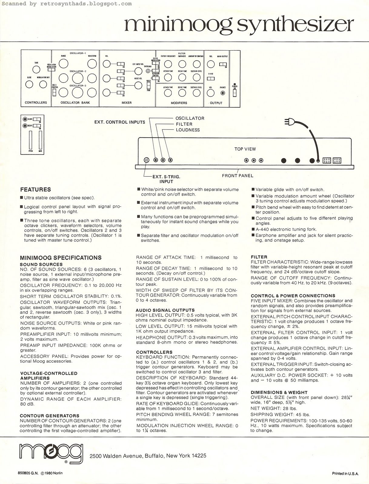
Moog Minimoog synthesizer reference sheet, 1980


Moog Minimoog synthesizer reference sheet from 1980.

This sheet is a member of the family of Moog reference sheets from 1980. I blogged about the Polymoog reference sheet from the same series last February.

Similar to the Polymoog sheet, I've seen links to low resolution scans of the front of this Minimoog reference sheet around the Web (everyone loves a great picture!), including synthmuseum.com. But not the back of the reference sheet- which in my opinion, contains all the juicy nuggets of great information that we love.

And when I say 'we', I do realize I am probably referring to me and two other people. Maybe that person in Churchill, Canada that keeps showing up in my stats. And maybe the person from Kiev, Ukraine. Seriously, though - I really do appreciate everyone for taking time out of your busy schedules to read my blog.


Back to the scans.

The front of this reference sheet stands out for one reason (well, apart from the great photo) - the ad copy includes the term 'musically engineered'. Moog had been using the term 'musical engineering' to describe their gear for quite a while by this point, including this 1977 advertisement, and in my opinion, at least partly in response to ARP's buzzword 'human engineering'. Even Octave Electronics got in on the 'engineered' action with their Cat SRM reference sheet.

But the back of the reference sheet is where the fun begins. Unlike the Polymoog sheet, the top of the Minimoog sheet includes a wire frame outline of the front panel, pitch/mod wheels, and top view. I really dig wire frame outlines but unfortunately only some of the reference sheets in this series included them. They seem all scientific or something. Even the Octave Cat SRM reference sheet I mentioned above also included a wire frame outline.

Most two-sided reference sheets I've come across include a wire frame image on the backside. Probably because it is a lot cheaper than printing another colour photo. Plus, there just isn't the room for a close-up of the panel in a two-pager. Many of the four-pager fold-out reference sheets I've come across like the one for SCI's Prophet-5 (will post in the near future) had the space to include a close-up of the panel on the inside pages rather than a wire-frame outline, while one-siders like ARP's Odyssey sheet (another future post :o), only included the front photo due to even greater space constraints.

I can't explain the two-sided ARP Soloist Mk II sheet I've posted in the past - it definitely had the room on the back for a wire frame outline, even though it doesn't really follow the standard 'reference sheet' format.

But definitely a missed opportunity in my opinion.

Monday, March 22, 2010

Aries Music Inc. Modular, July 1977


Aries Music Inc. modular synthesizer advertisement from page 48 of Contemporary Keyboard Magazine July 1977.

Between spending time doing a stint at a tradeshow booth, attending an art auction (that included eating lots of cupcakes) and some marathon Fallout 3 sessions, it has been a busy week. But I remembered coming across this quarter-page advertisement from Aries while flipping through CK the same time I had come across that Oberheim SEM Evolution full pager earlier this month. This ad only appeared once in the July '77 issue.

I had overlooked this advertisement when I blogged about this early Aries ad, so I was quite excited to come across it. I haven't seen it online either - maybe because, surprisingly, the ad doesn't include an actual photo or image of an Aries modular.

But it does include my very favorite thing about Aries advertisements...

THE LOGO!

To me, the prismatic-inspired 'A' symbol really did a great job positioning Aries both artistically and technically. Robert Leiner, owner of the most comprehensive Aries Web site I've ever come across, calls the logo 'spiffy'. I have to agree.

There is one problem with this ad that really gets under my skin. You see, the logo pulls my eyes upward, directly to the only ad-copy in the advertisement.

From a design perspective this is great - Zenbecca commented on this aspect of the logo in my previous Aries blog post. But from a grade-10-grammar-teacher perspective, the sporadic use of capital letters would get your hand slapped with a ruler pretty quickly.

Send One Buck for our New catalog

It may be the smallest text in the ad, but now, whenever I look at this ad, all I see is this sentence.

My irritation with capitalization disasters is a pet-peeve that I picked up over twelve years ago when I first started working in a communications and public relations department. My boss used to get mad at me all the time for not capitalizing properly. I don't claim to know all the rules... but I know the text above is breaking a few of them.

I'll even admit that I have trouble with my own blog posts. I changed the capital letters in this sentence back and forth a number of times before deciding which words should be capitalized:
Aries Music Inc. modular synthesizer advertisement from page 48 of Contemporary Keyboard Magazine July 1977.
And don't you dare go back to old blog posts to see if I have been consistent. Because I probably haven't. But then again, my boss doesn't see these posts.

Thursday, March 18, 2010

EML ElectroComp 101 Brochure, 1976


EML ElectroComp 101 brochure from 1976 (estimated).

Okay - I think I've let enough time pass that I've gotten over my little obsession with EML advertisements that I blogged about in December 2009.

This ElectroComp 101 brochure has definitely seen better days, but since I've only ever seen the front page of this brochure online, I thought some people might find the rest interesting - especially those interested in the specs of this machine.

But, before I get to the specifications listed on the inside of the brochure, I just have to make a few comments about the front page.

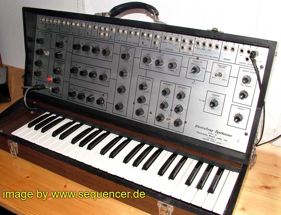
First - take a look at the image of the ElectroComp 101 on the front (and on the inside). They look normal enough, but, if you do a quick Google-images search for this synthesizer, you will notice that many of the other images of ElectroComp 101s that you see on the 'net have one extra feature. You will notice two cords running out of the bottom left-hand corner of the front panel.


Check out these images and compare:
I'm not at all familiar with this synthesizer, so someone else is going to have to clue me in. Mark Vail's book 'Vintage Synthesizers' does suggest that over the ten-year life span of the 101 there were some internal improvements made, but "the functionality of the instrument remained about the same from day one".

So, what is this second cable?

Second, and more fascinating, is the style of writing used on the front page. Even EML admits it - the text on this page is very 'cocky'.

Best this..., best that.... EML 'gives' us the best... .

That is a far cry from the ad-copy that is found in the advertisements in Contemporary Keyboard magazine where they are much more laid back - kinda like 'hey, if you are checking out synthesizers, you may want to check us out too'.

Normally this kind of talk would turn me off. Especially since they admit in this brochure that they are not really sure if they are 'number 2 or number 3 in synthesizer sales...'. (Are they just guessing...?)

But, read through the specifications section on the inside of this brochure, and you start to think that maybe they have reason to be cocky with all the features they have crammed into this little beast of a synthesizer that went for under $1500 at the time. Four oscillators. Sample and hold. Multi-mode filter. External input. And most importantly - a patch panel!

This really is quite the synthesizer!

Who knows... maybe I'm just too easy on 'em.

End note: before I sign off, I just have to comment on the fonts used in this brochure. I've stated before how much I love the font used for company name - 'electronic music laboratories inc.'. You can see this font in action on the back page of this brochure.

But, I gotta say, the font used on the bottom of the front of this brochure for the text 'ElectroComp 101 $1495' is also fantastic. Seriously. If nothing else, EML was a funky company.

I don't think I've seen EML use this font before, so I'll have to check my other EML reference sheets/advertisements for more evidence of the use of this font.

Stay tuned for more scans. :o)

Monday, March 15, 2010

Oberheim Four-Voice/Polyphonic Synthesizer, Contemporary Keyboard 1977

Oberheim Four-Voice Synthesizer/Polyphonic Synthesizer advertisement from page 4 of Contemporary Keyboard Magazine May 1977.

In my last blog post I featured an Oberheim SEM 'Evolutionary' advertisement from July 1977 where I threw out the theory that that ad was in response to a Moog chest-pounding advertisement that ran two months earlier (May 1977).

BUT. It wasn't like Oberheim was always on the defense. They had their own hard-hitting advertisements as well, and this one, located opposite the Letters section of CK (awesome real estate!) is one of those ads.

Although the ad-copy doesn't mention Moog and the Polymoog specifically, it is definitely implied as using the lesser method of producing polyphony in a synthesizer (mentioning 'synthesizer on a chip' - a direct connection to Moog's description of the Polymoog). Plus, the journal article text mentions the Polymoog in particular.

I find this ad particularly interesting for a few reasons.

1. Where Moog often pushed in-house resident expert Bob Moog out front to promote their brand, Oberheim, in this case, used external expert James Michmerhuizen, founder of the Boston School of Electronic Music, to promote the advantages of the Oberheim polyphonic system.

James Micherhuizen.... now where have I heard that name? To be honest, I couldn't recall right away, but a quick Google search jogged my memory rather quickly. Among other things, he wrote the ARP 2600 Owner's Manual that is still well-read today!

2. Basically, while Moog and ARP were name-dropping famous rock and jazz greats like Chick Corea, Kansas and Genesis in this issue of CK, Oberheim decided to name-drop the author of an equipment field test article to help promote the more scientific aspects of their Oberheim polyphonic system. An interesting marketing approach.

Even more interesting than this advertisement though, is the article on Tom Oberheim that appears in this issue of CK!

The article, written by Dominic Milano and simply titled "Tom Oberheim, Designer of Synthesizers) is about three pages long and really shows Tom's unique (and in my opinion humble) view of the synthesizer manufacturing world of 1977.

Like any good article from the 1970s dealing with one of the major players in the synth-building game, it starts out with a bit of history, most interesting of which I found was that Tom wasn't into rock music much until he heard the Beatles' 'We Can Work It Out' - he 'was hooked after that'.

The article then covers Tom's voyage from building amps for bands like The United States of America (USA), to discovering ring modulators and building one for Leonard Roseman, a composer working on the score for 'Beneath The Planet Of The Apes'. Soon enough, Chicago Musical Instrument Company (CMI), later Norlin Music and then later Gibson) was distributing Tom's ring modulator, and then his Phase Shifter and Universal Synthesizer for guitars ("...really sort of a turkey"), under the Maestro name.

Aside: In an email exchange with Tom Oberheim a couple of months back, he mentioned that he shakes his head whenever someone says he worked for Maestro. Quote from the email:
"Maestro' was not an actual entity, just a trade name applied by Chicago Musical Instrument Company, later Norlin, later Gibson, to various products made by a number of different companies. When Oberheim Electronics was still my company (1970 thru 1975) I designed and manufactured several products for CMI/Norlin under the Maestro trade name, including the Maestro Phase Shifter (the first phase shifter available for the performing musician), as well as several other effects pedals"
The article then goes through the history of Oberheim Electronics products that I know and love. First the digital sequencer, then the SEM, and finally, the addition of Emu's keyboard to create the 2 and 4-Voice synthesizers.

While speaking about Oberheim's connection to musicians, the article states that Tom met many musicians as an ARP dealer starting in the early 1970s, selling three to four ARPs per year to people like Frank Zappa, Leon Russell, and Robert Lamm. In fact, his first experience with a synthesizer made by someone else was the ARP 2600:
"I took it home one night, put it in my bedroom, and let it run on sample and hold all night".
Tom also admits in the article that one are of weakness for himself is tactile interfaces such as controls for pitch-bending wheels and modulation controls:
' "At the time I designed the units" he explains, "it was a matter of just going ahead. I hoped that I could get by without every little thing that would make them perfect." '
' "One of my past attitudes was that the only controller for the left hand that I liked was the Moog wheel," he admits. "I've always felt that it was so unique that it would be an out-and-out ripoff to use one. I've felt that way for a long time, but who knows? Maybe I'll sell out one day and copy it. A lot of guys do alright with the ARP knob, but I don't think it's right." '
Tom's humbleness comes through when talk of the 'big three' comes up.
'There is little question but that they're one of the big three. "It took me a long time to accept it," Tom relates, "but I think people talk in terms of ARP, Moog and Oberheim. Of course, I spend a little time thinking of how nice that is, but most of the time, I'm seeing how crude the 4-Voice really is. You don't need all those knobs now". '
In the article, Tom also comments on the growth of the synthesizer industry and the beginning of what is now commonly referred to as the gear-lust phenomenon:
"... the guy who makes his living playing, is taking more of his earnings and putting them into equipment. Let's face it, ten years ago a guy could buy a Twin Reverb and think that's all he needed for the rest of his life. Now, how many people you know with just one keyboard instrument?"
"I get people asking me if they buy a 4-Voice, can they get rid of their ARP 2600 or Minimoog? I have to say 'God no. You need that, too!"
Still with me? Great stuff. Thanks for reading!