Pages

Thursday, July 29, 2010

Sequential Circuits Inc. family of products, Keyboard 1982


Sequential Circuits Inc. family of products advertisement, including (clockwise) Prophet-10 synthesizer, Remote Prophet keyboard, Prophet-5 synthesizer, Poly-Sequencer, and Pro-One synthesizer, from page 50 of Keyboard Magazine February 1982.

This advertisement ran sporadically throughout 1982 starting in February. You've probably seen this ad numerous times on the Web, but I just had to post and blog about it because the ad has some absolutely great historical significance.

Not only was it one of the first ad campaigns to replace the famous Ear-Force campaign (along with the plexiglass Pro-One ad), but it was also one of the first SCI advertisement to use the new Sequential Circuits Inc logo.

Ever since I can remember coming across this logo, I had always thought the little swervy design element beside the logotype was supposed to represent recording tape. But, of course, I was wrong (again)...

The new logo was actually introduced and explained on page one of the February 1982 issue of 'The Patch' (Volume 2, Number 1) - SCI's customer magazine that included information about new products, hints and how-to's, patches, etc.
"SCI has introduced a new corporate logo designed by Greg Armbruster, Advertising Coordinator. Greg took the simple, reverse 'S' shape from the evolution of the treble clef and combined it with the existing Sequential Circuits typeface. John Mattos air brushed the design, creating a three-dimensional symbol and 'ruby' letters. Look for this new logo, which will be extensively used in all future ads and promotional campaigns!"
A treble clef! (*smacks forehead with hand*) How did I not see that? Geeez.

And even better, overly-blogged-about beloved Ear-Force ad designer John Mattos also had a hand in the design. Awesome.

If you've read past blog posts, you will know that I like researching the evolution of logos. I've blogged about SCI's early logo evolution before, and here we see more. The new logo started to appear on gear shortly after the launch - but there seemed to be a problem. Even as far as into late 1984 when SCI was about to change their logo yet again, you would see gear both in the wild and in ads that had both the new logo ('S' logo) and a version of the old logo (although, maybe technically it never was the logo without the 'inc' - but I'm going to keep calling it that). And we are talking both logos on the same piece of gear.

So, for example, all the Six-Traks I've come across have a non-treble-logo (sans inc.) on the front and a treble-logo on the back. Even when looking at Six-Traks in ads running as late as 1984.


(Photos shamefully taken from
MATRIXSYNTH's Flickr stream)

Drumtraks vary - I've seen ads from as late as 1984 with the old-style logo on the front, but my Drumtraks, and most of the ones I come across in the wild, have the new treble-logo on them. Prophet-T8's - old logo on the front, even in later ads.

I'm a big fan of consistency in branding - if you have a new logo, it should always be used. But I think I can see SCI's reasoning for continuing to use the older logo style in most cases. Aesthetics and/or real estate.

In gear that had already been designed like the Prophet-10, the front panels were really thin - so keeping the older logo makes sense. Otherwise the logotype would just appear too small. But, again, then why not include the 'inc.' as well? Consistency!

In gear designed after the new logo launched, such as the T8, the long thin wooden front panel screams for the old logo as well. In something like the Drumtraks, the front panel is a bit taller, so the treble-logo snuggles in nicely and is balanced.

So far, so good. Looks like SCI is making some good calls on when to use the old or new-style logo.

But then you look at the Prophet-600. All Prophet-600's seem to have the new logo on the front as well as the back. Finally! Consistency!

But when I look at it, that front logo just looks too small. Gah!

Maybe I'm just being nit-picky.

Probably.

Monday, July 26, 2010

Linn Electronics, Inc. LM-1 drum machine ad #3, Keyboard 1981


Linn Electronics, Inc. LM-1 drum machine advertisement #3 from page 52 of Keyboard Magazine July 1981.

Well - I think I'm finished with my Pro-One kick for a while. *Phew*. That last post involved a lot of typing. So, I'm going to keep this one short - hopefully.

This was the last of the three versions of the LM-1 'Real Drum' ads to run in CK. This blue version of the ad followed the gold version, consistently running in CK from June '81 all the way to the March '82 issue.

Besides the color of the ad, there are a few other subtle differences between the gold and blue versions - both dealing with the Linn logo.

First, the early version of the Linn logo that sat in the bottom right of the ad and that I loved so much has changed. I really liked that older version of the logo with the whole note/transistor image next to the Linn name. Someone should ask him to bring that old logo back. Maybe a limited addition retro-version of his AdrenaLinn III. Hey, did that say free shipping to Canada. Whoo whoo!

The second difference between the gold and blue ad (and more importantly) - the photo of the LM-1 is slightly different. A number of buttons seem to have been added or moved, and what I believe to be the volume knob that was originally located on the far left of the front panel of the LM-1 has move to a central location. In its space appears the OLD VERSION OF THE LINN LOGO! Excellent.

Hmmm... two different models, eh? I decided to do a quick Google image search to see exactly what was out there in the wild, and all the photos of peoples' LM-1's that came up in the results featured the newer model with the volume knob in the middle of the machine, but with the NEW logo in the far left corner. Plus, none of the photos in the image search featured the red button either - all were black.

I did manage to find one photo on flickr that featured the older model with the red button. But it featured not two, but three knobs across the top left side. These have to be very early versions of the LM-1. Maybe even prototypes that made it into the wild? I thought I read somewhere that Roger Linn was constantly making small changes to the design - so maybe this is proof of that evolution.

One other thing I noticed while researching - for a while, these LM-1 ads were often sitting opposite Sequential Circuits ads (or on either side of the same page) in Keyboard. In fact, this ad was featured directly opposite the second-last Pro-One advertisement I blogged about (which is what jogged my memory that I needed to finish with the LM-1 ads in the first place).

Could it be that Roger Linn and Dave Smith were like two peas in a pod back then? Kinda like today? Check out Steven Balsamo's photostream on Flickr for some other great photos of SF MusicTech Summit 2010.

I'm a little jelis!

Thursday, July 22, 2010

Sequential Circuits Inc. Pro-One ad #3, Keyboard 1982

Sequential Circuits Pro-One synthesizer advertisement from page 79 of Keyboard magazine October 1982.

I actually posted this advertisement back in early 2009 when I was a shy young lad and didn't really blog too much. But, since I'm on a roll with Pro-One blogging lately, I thought I would resurrect this ad since I still have some Pro-One history I'd like to get down in writing before the excitement wears out (could it?).

Hopefully you have already come across this clear plexiglass Pro-One advertisement. It's been seen in the wild, among other places, in CK magazine as well as SCI's customer magazine 'The Patch'.

Was it real? According to a comment on a synthtopia.com post that featured the ad back in September 2009 - No.
"Sadly, the clear plexi Pro-One was only a marketing gimmick. Dave Smith has confirmed to me that it was a non-working one off that was only for display at the NAMM show back in 81 or 82. I asked him if there would be clear mophos or tetras, and he confirmed in the negative. Which is sad, cause this one would drive trainspotters crazy on stage."
Too bad. Woulda looked real pretty.

I never really got around to talking about the specs of the Pro-One, and though there is quite a lot of technical information out there today on the InterWebz, there really was quite a bit of information bubbling to the surface back in the early 80s - some great references and historical commentary.

Around the time the Pro-One was launched in early 1981, and the first 'why another monosyth' advertisement started to appear in magazines, the Pro-One also made it into the Spec Sheet section of the March '81 issue of Contemporary Keyboard. It was pretty much your standard tech-sheet announcement:
"The Pro-One is a monophonic synthesizer featuring two VCOs that produce sawtooth and pulse waveshapes (the second oscillator also produces triangle waves), a 24dB/octave lowpass filter, two ADSRs, a C-to-C 3-octave keyboard, an arpeggiator, pitch and modulation wheels, single and multiple triggering modes, repeat and drone switches, 1-volt-per-octave control voltage in/out jacks and gate in/out jacks, and an internal interface for hooking the instrument up to most home computers. Also included with the unit are a built-in 40-note two-channel digital sequencer and extensive modulation facilities. Price is $645.00. Sequential Circuits, 3051 N. First St., San Jose, CA 95134."
Poor analogue thing was surrounded by announcements for sparkly new 'digital' devices - the Con Brio digital synthesizer, the Multivox digital sequencer and the Sony digital editor.

It wasn't until almost a year later, after the second Ear-Force ad ran in the second half of '81, and this third ad started its long, sporadic appearance throughout '82 that Keyboard magazine finally came out with an extensive report on the beast in the January '82 issue. A fantastically written piece by Dominic Milano - a well-known writer and editor for Keyboard.

In the report, Dominic does a great comparison between the Pro-One and another mono-synth of the time, the Moog Rogue.

You just have to read the first paragraph of the report to really get an idea of what the monophonic landscape was like at that time in history. And, interestingly, I think there is a parallel to be drawn in today's market for mono-synths.
"THE INFAMOUS MONO synth. It's not a disease. It's a tool for playing music, and in the last five years there have been a number of them brought out by various manufacturers, designed for the neophyte synthesist who perhaps doesn't want to spend a fortune on an instrument that they know little or nothing about."
So, back then, it looks like mono-synths were marketed towards new users that didn't know much about synthesis. Fast-forward almost 30 years, and what I see is mono-synths being marketing largely to software-based users that know little or nothing about hardware.

I realize I'm over-simplifying it a bit... but there is a comparison to be made... yes? no?

Keep reading that first paragraph of the report and historically significant references will just keep on smacking us in the face. It really gives us an idea of just how dominant the Pro-One became in the marketplace.
"A number of companies came out with low-cost monophonics in the mid- and late '70s, including Korg, Yamaha, and Roland. Moog's Prodigy did surprisingly well in the field of low-cost monophonics. In fact, it more or less dominated the field until the Sequential Pro-One became available in March of last year. Yet Moog dropped production of the Prodigy recently, replacing it with the Rogue, a synthesizer that was designed to fill an uninhabited spot in the market - that of the inexpensive inexpensive synth.
So, around 1982, we can begin to see the mono-synth market starting to segment. And Keyboard magazine recognizes this fully in the report. Dominic first comments on the Rogue:
"The Rogue would seem to be a bare-bones instrument, one that's designed to be as inexpensive as Moog could make it, with all the limitations that the words "low-cost" connote. It appears to be an instrument for the person looking for a simple and inexpensive synthesizer. Maybe it's just the right instrument for the player who's put off by electronics and lots of knobs and switches, but who wants to buy an instrument just to see if a synth is a useful addition to their setup."
And then the Pro-One:
"The Pro-One, on the other hand, packs a lot of function into a low-cost package. Corners are cut in places where ideally they wouldn't be, but the trade-off is that you get a lot of function in an inexpensive package. ... The Pro-One would seem to be an ideal instrument for someone who is into high-tech but doesn't have the pocketbook to support the habit."
The report then goes through the basic features of each - first the Rogue, and then the Pro-One. A great technical read. And at the end of each mini-report, is a conclusion. Dominic's conclusion about the Rogue is simple - it's cheap, and "it's pretty good at lead lines". He gets a little more in-depth with the Pro-One conclusion - and provides us with a little bit more technical history about the Pro-One in the process.
"The Pro-One does a more than reasonable job at being a low-budget monophonic synthesizer. Its sound strikes some people as being a bit thin, while other seem to like it."

"The most negative thing about the Pro-One are all the stories of the infamous transformer death that seems to be plaguing the instrument in its early days. What reportedly happened was that in shipment (especially when handled roughly), the transformers came off of the circuit board mountings and did a wonderful job of trashing the guts of the instrument... This problem was fixed by SCI after they started hearing about the complaints. They started bolting the transformer to the circuit board. This change was made beginning with serial number 1811. In any case, this instrument does a lot of things that monophonics costing twice as much don't. It's definitely worth checking out if you're in the market for a first synthesizer. Price is $745.00."
Remember the original spec sheet description nine months previous. The cost of the Pro-One was listed at $645. Less than a year later the price was bumped up a hundred bucks.

In the final, final comparison, Dominic reiterates earlier comments about cost vs functionality, but then writes something rather interesting.
"Actually, we're a little bored by the industry's insistence on the now-'standard' two oscillators, one filter, two envelope generator approach to monophonic synthesizers... It's a fair guess that there will be other low-cost monophonics coming out in the future. The question is, will they offer any new design features, or will they be just new versions of the Minimoog? We'll have to wait and see."
Wow. New version of the Minimoog, eh? I can't say I'm bored yet. :o)

Monday, July 19, 2010

Sequential Circuits Inc. Pro-One ad #2, Keyboard 1981


Sequential Circuits Inc. Pro-One synthesizer advertisement #2 from page 53 of Keyboard Magazine July 1981.

When I first came across this Pro-One ad, I mentally filed it right up there with that sparse Moog advertisement I blogged about last September. In that post, I asked the question:
"Could you imagine any company BESIDES Moog trying to pull this off today?"
Well, Moog could today :o)

Back then, I guess SCI came close. And although they didn't go so far as Moog did in their ad - no logo, contact info, famous people or free stuff - they definitely knew they could create a minimalist ad that wouldn't confuse the audience.

This was the second Pro-One advertisement to be featured in the magazine, after the first 'Why would anyone build another monosynth' ad appeared during the first half of 1981. It ran sporadically until the end of 1981, when SCI replaced their beloved Ear-Force campaign with ads that featured artwork of a more realistic, but still comic-like Tolkien wizard-dude.

But even though the Ear-Force ads stopped running at the end of 1981, SCI recognized the popularity of the artwork and together with the Prophet-5 and Prophet-10 ad-art, created a set of posters that were still available for quite a while afterwards - and featured in SCI's 'accessories' ad that ran in the December 1982 issue. (Side note: One of my favorite pieces of synth merchandise history is my SCI belt buckle, also featured in that advertisement. )

The artwork of John Mattos is so distinctive and the wizard-dude became such a symbol for the company that you can still recognize the guy in this advertisement even though you only see part of his face, along with his boney hand and sleeve cuff.

Two questions quickly came to mind when viewing this ad - and I quickly came to the logical conclusions to both pretty quickly.

1. Why would SCI even have bothered with that first Pro-One ad when this one is obviously superior. That initial Pro-One ad had the logo and sky/cloud imagery typical of the Ear-Force look-and-feel, but it definitely wasn't a full-on 'Ear-Force' ad with the wizard-dude and cockpit/airplane imagery found in the Prophet-5 and -10 ads.

2. Why is that writing at the top of the ad so small?

But I quickly realized that unlike the Prophet-5 and Prophet 10, the Pro-One was still unknown to the public. A transitional text-heavy ad was required so that the audience could first learn a bit about the instrument - a monophonic version of it's big brothers. The Prophet-5 and -10 were probably instantly recognizable because they had been around for a while, but the Pro-One wouldn't be.

And maybe this is just a coincidence, but I think artist John Mattos and/or SCI must have realized this fact and you will notice that the image of the Pro-One in this advertisement has much less detail than you will find in the images of the Prophet-5 and -10 in their ads. The ad just doesn't need it. As far as the small print at the top of the ad is concerned, this was a necessary evil to make sure readers unfamiliar with the initial Pro-One ads would know exactly what the Pro-One is - 'a new standard in monophonic synthesizers!'.

On the other hand, one might argue that the audience's unfamiliarity with this new instrument would be precisely the reason why there should have been more detail in the artwork of the Pro-One - so that it could continue to become more recognizable. And maybe that ad-copy should have been larger for the very same reason.

But I'm such a fan of John Mattos that I'm tempted to say *%$# it - keep the print small and let that Wizard-dude speak for the company. He became the Jolly Green Giant of the synthesizer world, as was recently pointed out to me by my food-obsessed girl-friend.

Thursday, July 15, 2010

Sequential Circuits Inc. Pro-One, Contemporary Keyboard 1981


Sequential Circuits Inc. Pro-One synthesizer advertisement from page 27 of Contemporary Keyboard March 1981.

I've been experiencing a lot of déjà vu lately. First it was that keytar blog post that knocked me square back into the 80s, and now this. Although this most excellent 'Ear-Force' advertisement from Sequential Circuits Inc. came out in 1981, the same question featured in this ad could just as easily have been inserted into an advertisement for one of the many recently released monophonics.

"Why would anyone build another mono-synth?"

It may have been a valid question in 1981. Maybe. But, really, I don't think you need to ask that question today. We've all finally learned why. It's because of how great that first round of mono-synths were. Maybe it just took a while for some of us (including the manufacturers) to catch on to that fact.

I bought my first analog mono-synth - a used Pro-One - in a mall music store way back when. I didn't know much about analogs back then, but just one look at all those knobs and I knew I wanted it. Since then I've been lucky to play with quite a few of the first-rounders.

And my first experience with the reintroduction of monophonic synths was propbably in the mid-90s with the release of the Korg Prophecy - an early virtual analog synthesizer that came out of nowhere to deliver some juicy digital monophonic goodness. And ever since, I've noticed that the new round of mono-synths coming out have gone back to their 1970's/80's analog first-rounder roots. Gear like Tom Oberheim's recent re-release of the SEM or Moog's Voyager.

Dave Smith, founder of SCI and creator of the Pro-One, also went this route, releasing a whole new batch of mono-synths - directly comparable to his originals.

I'll admit, his first mono-synth under the DSI name, The Evolver, doesn't really compare with his older products (although I believe they do have curtis filter chips :o). I picked up one of the early Evolvers right off his original Web site because my local music store wouldn't bring them in - I just couldn't convince them to bring it in even though it is one serious synthesizer.

But his later products - the Prophet '08, and then the Mopho and Mopho Keyboard, didn't have a problem making it into my local music store. Probably because they did follow a very similar evolutionary tech- and time-line to his originals - the Prophet-5/10 and then the Pro-One.

The "Prophet '08" name isn't the only clue that sticks out like a sore thumb. A quick comparison of the descriptive wording in this advertisement to the Mopho Web pages make the big brother/little brother connection clear (like you didn't already know...):

Pro-One ad: "... the Pro-One has the same electronics as its big brothers, the infamous Prophet-5 and the Prophet-10"
Mopho Keyboard Web page: "The voice architecture is similar to a single voice of the Prophet '08..."

The modulation capabilities is one of my favourite features of the Pro-One, and luckilyDave Smith decided to carry the extensive modulation traditions to the Mopho too.

Of course, with the Mopho you also get more of everything else. LFOs, envelopes, etc... and all the benefits of current technology - three banks of 128 programs (384 total), software editor, USB, and midi.

So, does it replace the Pro-One? Well, I demo'd the Mopho Keyboard down at my local shop and, as expected, it does sound great. Technically it might replace the Pro-One, but not in my heart. I won't be selling the Pro-One anytime soon.

But I will be buying a Mopho.

And probably the desktop unit if I can locate one locally. I fell in love with desktop modules when I first came across the Kawai K1m. I loved that vector joystick and I can still hear that choir/string patch... Aaaaaaaaahhhhh.

End note: Just to be clear - I didn't receive any money, gear, smooches or hugz for writing this blog post. Not from Dave Smith, his close work associates ... or from Kawai for that matter. I just dig my Pro-One, Evolver (and K1m)... I'm about to dig a new Mopho too. :o)

Monday, July 12, 2010

Linn Electronics, Inc. LM-1 drum machine ad #2, Contemporary Keyboard 1981


Linn Electronics, Inc. LM-1 drum machine advertisement #2 from page 27 of Contemporary Keyboard May 1981.

I'm writing this post on World Cup day, and although I haven't been a very loyal fan in the past, I've slowly been getting caught up in the storm because of a few friends wearing orange lately. And since I'm a classic knee-jerk kinda guy, I have to automatically cheer for the opposing team - so... Go Spain!

Game time is in half an hour, so I'm going to keep it short.

Like many of the teams playing in the World Cup, Linn had been slowly gaining momentum with their LM-1 advertisements. To get an idea of what I'm talking about, you only have to compare this second LM-1 advertisement, known by it's creator as 'the gold ad', to Linn's first LM-1 ad I blogged about last week. It ran immediately after its predecessor, from about February to May, 1981.

You see, I'm a big fan of 'iteration'. When my CEO comes to me and says we need to rebuild our Web site, I don't spend three years building a totally different site. Instead, I'm constantly analyzing the current state of the site, looking at what works and what doesn't, making small changes over time. The marketing people hate this because they don't get to write a big news release, build a big new advertising campaign, and write ten pages of speaking notes for our call centre. But, users of our Web site love this because it allows them to stay familiar with the site while I slowly make changes for the better - over time, and with little budget.

You can definitely see that Roger Linn and the ad's designer, Eric Wrobbel, did a similar thing. They took a look at the original ad, discussed what might need a bit of tweaking, and kept the momentum moving forward while maintaining all that LM-1 advertising goodness.

As you can see, here's a couple of those tweaks...

1. Colour! I don't know what the cost difference was between a black+white or a colour ad in 1981, but it was definitely worth it. Unlike the LM-1's first ad, this one pops off the page.

2. The 'Real Drums' tag line also jumps out at you in this ad - it's the first thing you read. As much as I like the funky font used in the black+white version of this ad, the font style, and it's placement behind the photo of the instrument, made it blend in with the rest of the ad and I felt my eyes had to go looking for it.

3. The name of the actual LM-1 is moved from its awkward position to the right of the photo into the much-improved tag-line - "The LM-1 Drum Computer - a new breed of rhythm machine'. Much better than the old tag-line - "Here's the most amazing rhythm machine ever!". Everrrrrrrrrr! :o)

4. The best part of this advertisement is the introduction of an early version of the Linn logo. If you are a regular reader, you know I'm a big fan of logos like those of Oberheim and Aries, and I have to say that Linn's logo can sit proudly within this esteemed tattoo-worthy group. Especially noteworthy is the symbol sitting to the left of the 'Linn' name, effortlessly merging both the musical and technical aspects of the company.

Eric Wrobbel, the creator of the ad including the logo, includes a bit of history about Roger Linn and the evolution of the logo on his Web site:
"The symbol used ahead of the Linn name was an amalgam of a musical whole note with the technical symbol for a transistor inside of it. To the rest of the world it just looked like an “O.” Roger quickly tired of being called Mr. O’Linn and we changed it..."
Brilliant commentary! Gotta love the backstory. I know I do.

Thursday, July 8, 2010

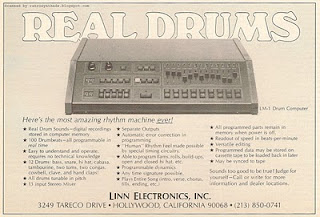
Linn Electronics, Inc. LM-1 drum machine, Contemporary Keyboard 1980


Linn Electronics, Inc. LM-1 drum machine advertisement from page 34 of Contemporary Keyboard December 1980.

As alluded to in my last blog post on keytars (Casio AZ-1 advertisement), there are certain pieces of gear that make me think of summer, and in particular, summers in the 1980s. Well, the LM-1 definitely falls into that category, probably because hearing those sounds in songs from such bands as A-ha, Berlin, and Ultravox take me straight back to that decade.

This is probably the earliest LM-1 advertisement to be found in CK. It only ran once or twice in black and white before a new slightly different colour version of the advertisement came out that included a different 'Real Drums' font, the addition of an early Linn logo, and some changes to ad-copy formatting/placement.

Often when I first start an advertisement blog post, I will scribble down a few points about the advertisement on paper to get the brain juices flowing, and then do a bit of Googling to get some background research and ideas. I tell you this for a reason that will be come clear in just a moment.

My initial scribbles for this advertisement included these three points:
  • No logo - booo!
  • That's one crazy 'Real Drums' font
  • Interesting contrast to have the 'real drums' text behind a decidedly non-real drum (ie: a drum machine)
Then, when I started my Google searches, I quickly came upon Eric Wrobbel's Web site. Eric is a designer and author with a huge fascination for vintage radios and televisions. He's written a wack of books on early transistor radios from Sony, Standard, and Crown, as well as on toy walkie-talkies and toy crystal radios. The designs of these products are vintage-ly awesome, down-right inspiring, and best of all, many of the model names sound suspiciously like our favorite analogue synthesizers and drum machines. Names like the TR-55 and SR-F21. Click on the links above to see a few pages from his books that include photos.

But, back to the point.

You see, Eric was also the guy who designed THIS LM-1 advertisement back in 1980. And he designed other gear ads for companies such as 360 Systems, Akai, and Mitsubishi as well. He includes many of his ads in the 'Art' section of his Web site, complete with juicy commentary.

Here's what he has written for this LM-1 advertisement, and I've highlighted a part of it in bold:
"This unassuming little layout got the job done extremely well. And it did no harm, as many first-time ads do to new companies who naïvely publish silly, amateurish work and then spend years digging out from under the damage.

This was the very first ad for the Linn LM-1 Drum Computer. Roger Linn and I thought that the phrase “Real Drums” juxtaposed with a picture of something that looked decidedly unlike real drums would make for a provocative headline. Ad copy goes on to explain the LM-1 actually does play real drums, digital recordings stored in computer memory.

If you go back to my third little scribble, you will see that I also had initially pointed out the contrast between the title copy (Real Drums) and the image of the drum machine.

What is it that they say about great minds thinking alike... I kid. I kid. I don't make this comparison to try and come off as some kind of genius. Exactly the opposite.

The thing is, when I'm commenting on many of these ads, I'm doing it blind a lot of the time. I can make certain assumptions about why the creator of an ad might have used certain ad-copy or design elements in a certain way. But really, a lot of the time it's just an educated guess. Your interpretation may be totally different. I suppose that's what's cool about advertising art.

And that's why I really appreciate having someone like Eric Wrobbel take the time to document the ideas and processes that were involved in the creation of his ads. I find the best part of blogging is digging up the backstory - and sometimes the assumptions that you make turn out to be totally wrong.

Like when I tracked down Marco Alpert and the history behind Emu's 'Arthur C. Clarke' advertisement. Who new it would be such a simple explanation. But it was the journey that made it interesting.

It makes me appreciate these ads so much more. :o)

Monday, July 5, 2010

Casio AZ-1 Remote Keyboard Brochure, 1986 (est)

Casio AZ-1 Remote Keyboard brochure from approximately 1986.

Its been so warm and sunny outside, that I thought I would jump a decade into the future from my previous posts and write about an ad or brochure that reminds me of summer. And keytars definitely make me think of summer for some reason. Maybe it was the bright fashions of the time?

So... meet Blane. Well, from the ears down.

Yellow blazer with rolled up sleeves. Check!
Thin tie with music note pattern. Check!
Stripy pants. Check!
Keytar. Check!

It must be 1986. Or 2010.

My GF started calling him Blane in homage to the character of the same name from the movie Pretty in Pink ("His name is Blane? Oh! That's a major appliance, that's not a name").

I'm almost more tempted to think that Duckie would have been more likely to have played the AZ-1 on a stage somewhere in his mid-20s, but Blane (from the movie) resembles much more closely the dude on the cover of this brochure. And you just know this guy's gear (and clothing) was paid for by daddy.

Of course, in the movie, Blane turns out to be a great guy and ends up bagging the girl in the end. I've never been sure how I felt about that come-back by Blane, and I get the same unsure feeling when I start thinking about the comeback keytars are currently making.

If you don't believe that keytars are making a comeback, you just have to look at the rumor-recently-turned-fact that Rock Band 3 will feature a keytar. Or that, unbelievably (or maybe totally predictably), Roland had continued to manufacture the AX-7 keytar as late as 2007, and then in 2009 released the AX-Synth keytar.

A quick 'keytar' search on MATRIXSYNTH will also give you a good indication of keytar-love.

And calling it a 'comeback' may be a bit of a stretch too. Createdigitalmusic.com posted an article back in 2005 called 'Keytar lives: Roland's AX-7', and you just have to browse through the comments to realize keytars have been drooled over by a certain segment of the keyboard-playing population for quite some time.

And, I have to admit the keytar does have a great deal going for it.

1. Devo used one.
2. Howard Jones used one.
3. I'm pretty sure Thomas Dolby used one.
4. Um.... er... did I mention Devo used one...?

Those facts alone are enough for me to buy into the keytar experience this second time around. And maybe even a third time around in another twenty years.

But even before we started to see the recent influx of keytars in pop culture, there seemed to have already been the rumblings of a backlash.

Synthtopia published an article online back in November 2008 called 'Proof That Herbie Hancock Is The Only Guy Ever To Look Cool Playing The Keytar', with a follow-up article the next month called 'More Proof That Herbie Hancock Is The Only Guy Ever To Look Badass Playing The Keytar'. And those photos, and other photos like them, tend make a strong argument (photos of Devo, Thomas Dolby and Howard Jones excluded of course).

Also, a Facebook group called 'Expose the Great Keytar Conspiracy!!!', created by Dante and Jonnie Stone, currently contains 93 members at the time of this writing. The title of the group includes three exclamation marks, so you know the Stones must mean business. But, one look at the member's photos, and you realize that its looking more and more likely that this Facebook page might have been created out of shear jealousy and spite. Just guessin'.

And if the people in that Facebook group are jealous of anyone, its probably the guy in the YouTube video below. He created his keytar out of Commdore 64.


Or maybe this guy shredding on his keytar.


I'm still officially on the fence about the keytar. Although, I'm sure the millisecond that I try one out in my local Long and McQuade music store, I'll be transported back to 1986 faster than John Cusack in Hot Tub Time Machine.

Like for sure. Totally.

Thursday, July 1, 2010

Aries AR-329 Voltage Controlled Phase/Flange Module, Contemporary Keyboard 1977


Aries AR-329 Voltage Controlled Phase/Flange Module from page 46 of Contemporary Keyboard Magazine November 1977.

Up until November 1977, Aries ads in both Contemporary Keyboard and Synapse magazine were... well.... they were nothing really outstanding - except for that awesome logo! Take a look at these blogged ads for examples - July 77 CK, August 77 CK, March/April 77 Synapse.

Then, something happened. They found their marketing mojo and came out with this highly-targeted ad in Synapse. Around the same time, the 1/4-page module advertisement you see above came out in CK.

Normally I'm not a fan of smaller ads in magazines, but in this case I'm tempted to make an exception. I think Aries found the perfect format for a relatively low-cost way of advertising single modules - especially if this module was as unique as the ad makes it out to be (and apparently it was). Aries used the space well by including a close up of the module itself, with the text laid out beside, and not on top of, the photo. Clean and simple. The font is almost too simple.

Really, the only real problems with this ad are:

1. As far as I can tell, Aries only ran this advertisement twice - Nov'77 and Jan'78. It would have been much better if this ad had run as many times as possible in succession to get maximum impact.

2. It only ran in Contemporary Keyboard - a magazine that I would think has a more generalized keyboard playing audience. I would be inclined to argue that this ad would have been able to better reach more of its target audience if it had appeared in Synapse. But as was pointed out to me in an email after my last blog post, the average Synapse reader may have been more inclined to take action on an Aries advertisement, but that audience may have been a whole lot smaller than CK. In other words, that small slice of modular owners/builders that read CK may have been larger than Synapse's audience as a whole.

[Reminder to self: find some circulation numbers for these mags.]

So, how unique was this module? Unique enough that Aries though that it deserved its own advertising campaign. And that campaign actually started before the ad came out. You can see the first signs of the promotion in the Spec Sheet section of the previous issue of CK (Oct'77).
"The AR-329 stereo phase/flange module is a voltage-controlled phase shifter with variable resonance. The manufacturer informs us that its signal-to-noise ratio is better than 7-db. the device is compatible with standard 1 volt/octave synthesizers, and both linear and exponential control-voltage inputs are provided. The unit provides 1800 degrees of phase shift at the fundamental frequency. Price is $159.00 in kit form, and $245.00 assembled and tested. Aries Music, Box 3065, Salem, MA 01970"
Synapse included some similar info in their What's New section of the Nov/Dec'77 issue.
"The AR-329 is a voltage controlled phase shifter with variable resonance or "Q" and features 1800 degrees of phase shift at the fundamental."
But, those specs don't tell the whole story.

Robert Leiner, owner of one of the best Aries sites on the Web, has a great technical description of the AR-329 module and specifically mentions how unique it is.
"The AR-329 is a voltage controlled phaser. Usually people think of phasing as a special effect - swooshing, jet-sound, etc. Very few people have had a chance to use a phaser that isn't controlled by an internal oscillator, so fail to discover that a phaser can be uniquely effective timbral modifier."
You can read the rest of Robert's technical description of the module on his Web site.

For more of a musician's description on the AR-329, I naturally turned to Kevin Kissinger, the Aries synthesist from my last blog post. He had some great comments on its unique sound:
"To patch a sine wave to the VC input gives a typical phaser effect -- that is, the comb sweeps up and down as the sine wave's voltage rises and falls. The phased effect is the result of mixing the delayed signal with the primary signal. The Odd/Even switch inverts the phased signal and is very effective.

The "Q" control functions like most "Q" controls -- that is, it controls feedback. The AR-329 is designed to suppress uncontrolled feedback however at the highest Q setting at some input frequencies the AR-329 produces a "glitchy" kind of feedback -- it sounds more like static than clear feedback.

However, if one backs off the input signal (there is a front panel input pot for this) one can run at the highest Q setting and avoid the static. The sound is very throaty -- very colorful -- a lot like a Clavinet.

The AR-329, as are most analog phasers, is a little noisy. When the phaser is at the end of my signal chain, I always noise-gate it with a VCA. If the phaser is fed a steady amplitude signal (i.e., from a VCO or the noise source) then noise is not a problem."
Overall Kevin is very happy with his AR-329 and finds that it can perform outside of its traditional role of a phase/flange.
"Often, I run the module at minimum Q with no CV input and just set it as a form of fixed EQ. This is handy particularly when one wants to vary the amount of "boominess" in the bass.
If anyone else has anything to add about this module, please don't hesitate to leave a comment below or email me.

Oh, and happy Canada Day everyone! :o)